Hubbell Realty Company
Design That Earns the Brand

Project overview
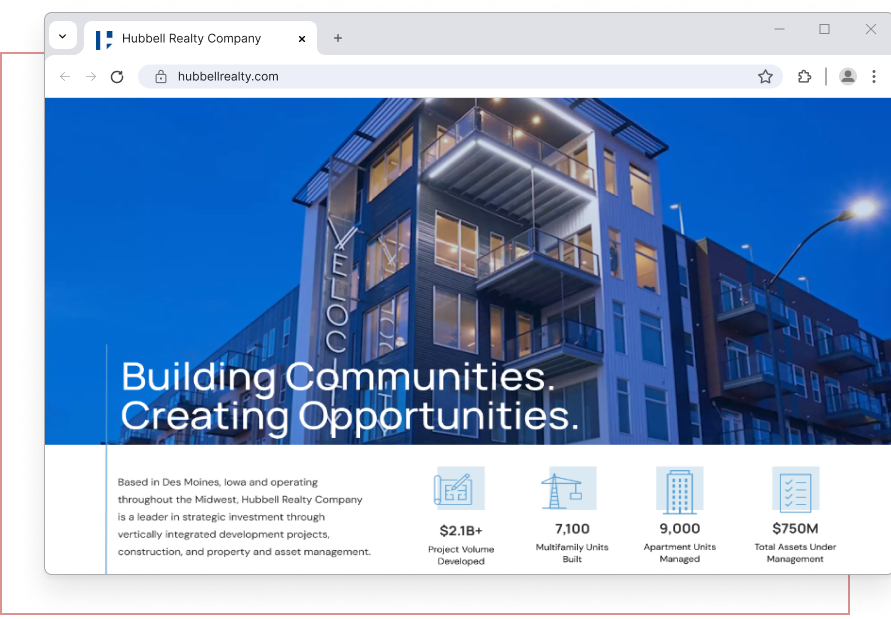
Hubbell Realty Company is a full-service real estate leader with more than 170 years of history in Central Iowa and Greater Nebraska. I joined as UX Designer to lead the redesign of their public-facing website, helping translate the depth and quality of their work into a cleaner, more credible digital presence..
Duration
• March 2025 – May 2026
Role
• UX/UI Designer
• Information Architecture
• User Research
Team
• 1 UX/UI Designer
• 1 Senior Web Designer
• 1 Project Manager
• 1 Client Strategist
• 1 Digital Client Coordinator
• 2 Web Developers
Tools
• Figma
• Adobe Illustrator
• Adobe Photoshop
• Lyssna
• Microsoft Excel
• WordPress/Elementor
The Challenge
Hubbell Realty has earned a strong reputation across Iowa and Nebraska: award-winning projects, a vertically integrated service model, decades of community investment. Their website wasn’t reflecting any of that.
Built seven years earlier on an aging CMS, the site had become a constraint. The redesign needed to address several compounding problems:
- The full scope of what Hubbell offers wasn’t visible. Homebuilding brands, investment services, and the depth of each service line were buried beneath the surface.
- The homepage led with a single development project rather than the company itself.
- An extensive library of beautiful project photography that wasn’t being used to its potential.
The redesign needed to surface the full business, showcase the work, drive investment, and be built flexibly enough to evolve as the company’s brand develops.
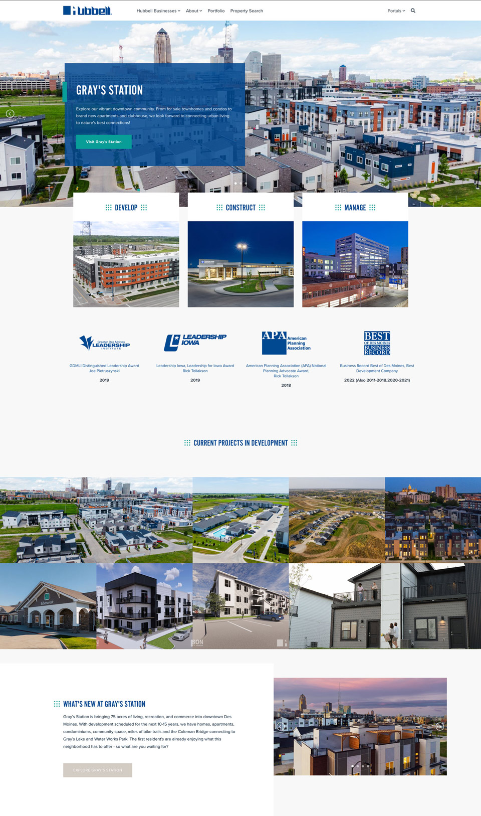
The homepage didn’t offer much information about the company. The full scope of their services isn’t captured beneath the top-level categories. Tan buttons with white text were not meeting ADA compliance for accessibility.
Discovery
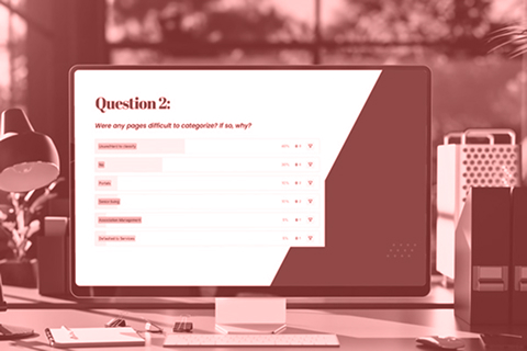
Card Sort
I ran an open card sort with 20 participants from the Midwest region, asking each to group 24 pages from the existing site into categories that made sense to them. The results confirmed what we suspected: the existing structure didn’t match how anyone outside the company thinks about real estate.
- Participants created 81 unique categories — a clear sign the content groupings weren’t intuitive.
- The most natural groupings were Homes, Services, About, Communications, and Communities — quite different from the existing structure.
- Real estate terminology was a consistent barrier; terms that felt distinct internally read as repetitive and overlapping to outside users.
- Users wanted more context upfront to distinguish what each business or service actually does.
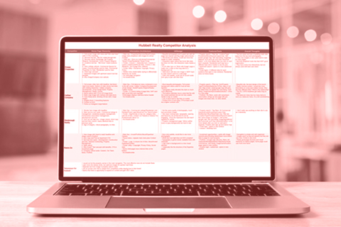
Competitive Review
A review of four regional real estate firms confirmed that the strongest sites lead with clear service categories rather than brand or property names, and that high-quality photography is what separates the memorable ones from the rest.

Design
The research pointed to a straightforward structural fix: break the business into four clear service categories, elevate investing as its own section, and give each business line enough page real estate to be understood on its own terms. The layouts were built to put Hubbell’s exceptional photography library front and center, using imagery to communicate quality in a way no competitor in the region is currently doing.
Home
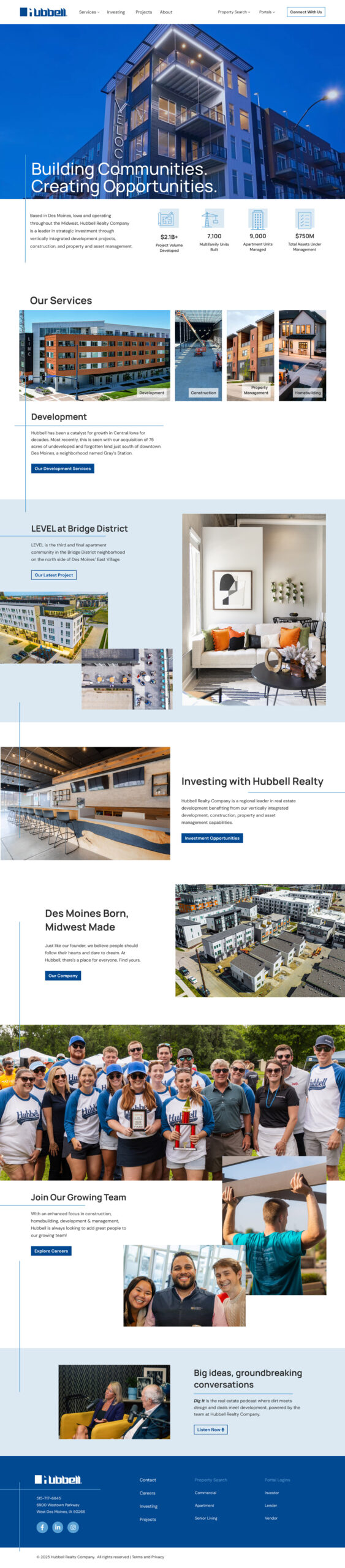
The homepage leads with the company, not a single project. A video hero establishes Hubbell’s scale and breadth, followed by clear service entry points and stats that communicate the weight of what they’ve built. Animated lines guide the user’s eye as they scroll, reinforcing the sense of movement and progression through the content.
Service pages
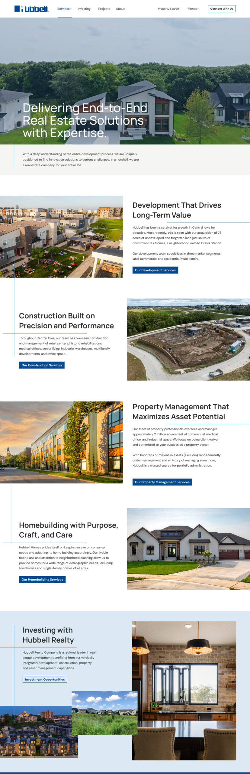
Four service categories — Development, Construction, Property Management, and Homebuilding — each with its own section, photography, and direct path forward. The business model is visible at a glance for the first time.
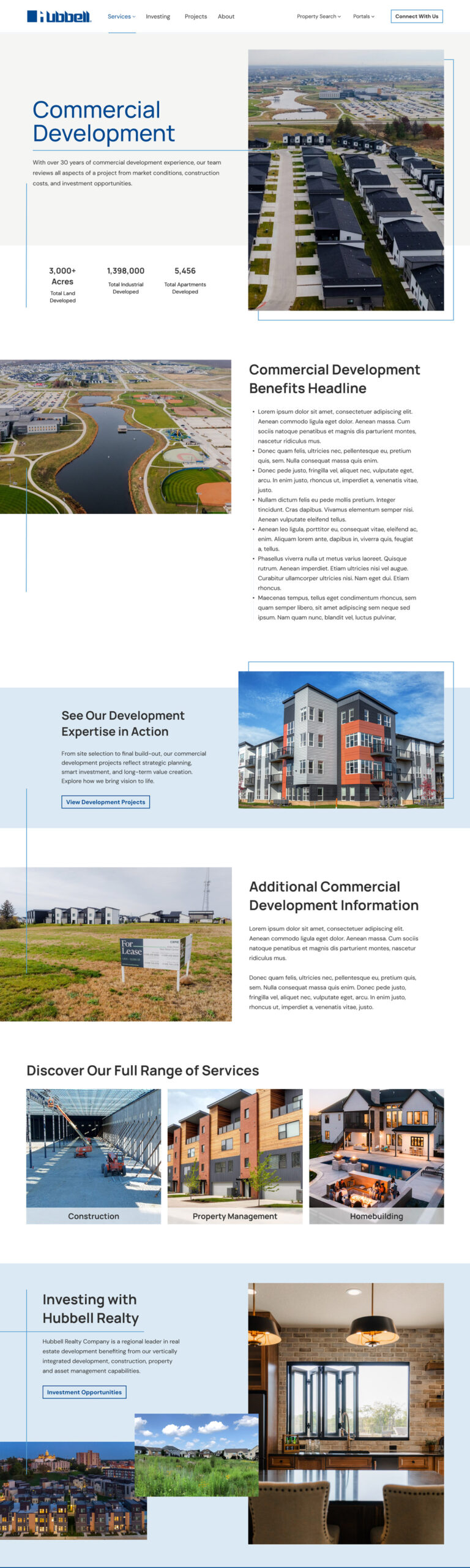
The depth that was missing before: stats, context, cross-sells to related services, and an investment callout. Everything a prospective partner or investor needs to understand what Hubbell actually does and why it matters.
Project pages
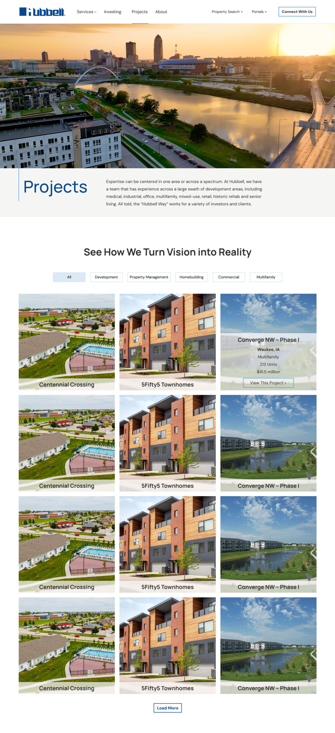
A filterable grid organized by service type, letting the photography carry the page. Breadth of work that was never visible before, now front and center.
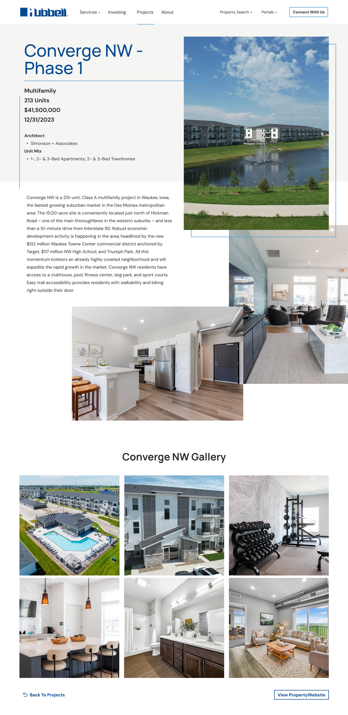
The photography library given real room. Interior and exterior shots presented in a gallery format that reflects the quality of what Hubbell builds.
The Result
A company with 170 years of history finally has a website that reflects it. Four clear service lines, a mega menu with visual context, new pages for previously invisible services, and photography given the room it deserves.
Key outcomes
A business model that’s finally visible.
Four service lines, multiple homebuilding brands, investing, projects, and a podcast, all surfaced with enough context for users to understand what Hubbell does and what’s relevant to them.
Design that matches the company’s quality.
Large, optimized imagery and a cleaner visual hierarchy bring the site up to the standard of the work Hubbell produces, setting them apart from every competitor in the region.
A platform the team can actually use.
Reusable Elementor templates replace seven years of CMS constraints, giving the Hubbell team the ability to make updates and grow the site without routing everything through a developer.