Lutheran Church Of Hope
A Website That Grows with Its Church
Project overview
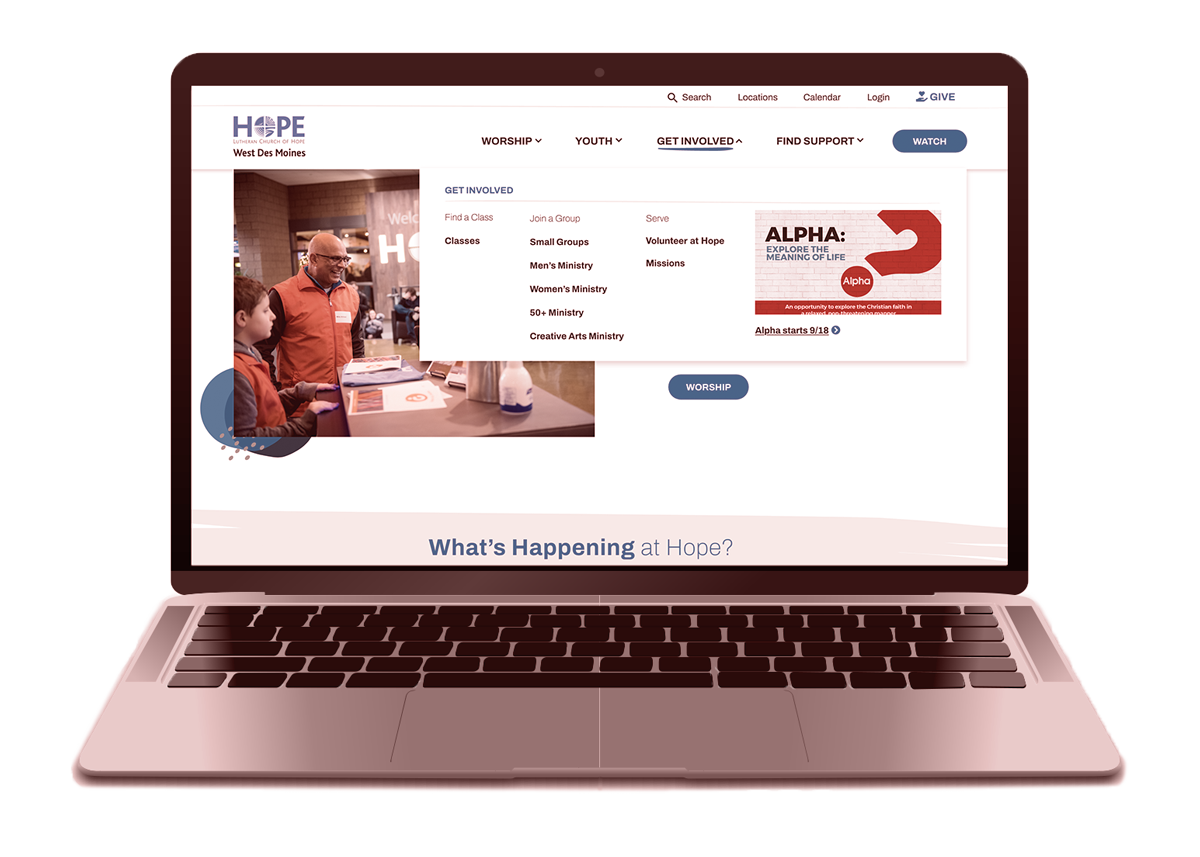
During my time at Strategic America, I led the redesign of a site that struggled to support streaming, digital ministry and multiple campuses. The result was a clearer, more unified experience that makes information easy to find and simplifies updates for every team.
Duration
• June 2022 – November 2023
Role
• Lead UX/UI Designer
• User Research Support
Team
• 1 UX Designer
• 1 Project Manager
• 1 Client Manager
• 3 Web Developers
• 1 Web Administrator
• 1 UX Researcher
• 1 Communications Director
Tools
• Adobe XD
• Adobe Illustrator
• Adobe Photoshop
• Optimal Workshop
• Octopus.do
• Microsoft Excel
• WordPress
The Challenge
The biggest issue was fragmentation—both for users and for the people managing the site. Each campus handled content differently, important tasks were buried, and the tools powering the site weren’t built for how the church operates today.
Key Problems
1. “We can’t find anything.”
Calendars, classes, volunteer sign-ups, and event updates were confusing or hard to navigate. The site lacked a strong organizational overview.
2. A structure that no longer fits.
The CMS wasn’t designed for multiple unique campuses or growing digital offerings. Updates for each campus had to route through a central team, creating unnecessary overhead for staff.
3. A homepage that didn’t tell their story.
Worship wasn’t front and center, and key content like video, outreach and the podcast were easy to miss.
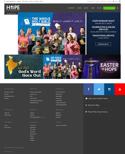
The homepage didn’t give new users a good sense of who they were. Existing church members had a hard time finding common tasks.
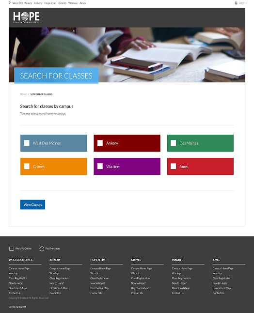
The class search wasn’t intuitive and didn’t show the breadth of classes available at first glance.
Discovery
Discovery focused on understanding where the website was falling short for both users and staff—and why. The findings revealed a clear disconnect between the strength of the church’s ministry work and how easily people could access it online.
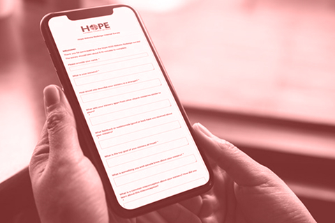
Internal survey
We surveyed church staff and ministry leaders across campuses to understand where the site was falling short internally. The clearest themes:
-
Navigation and search were consistently frustrating across campuses.
-
Classes and events were too tightly tied to the calendar, making planning ahead difficult.
-
Leaders wanted less clutter, clearer language, and more obvious next steps.
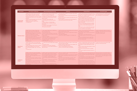
Competitor analysis
A review of churches of similar size and complexity revealed a consistent pattern:
- Simplified navigation looks clean but often creates confusion on deeper exploration.
- Broad, vague labels without supporting context forced users into trial-and-error clicking.
- A mega menu with clearer labels and better groupings offered more context than a stripped-down nav without adding complexity.
of participants couldn’t find how to volunteer
couldn’t find addiction support content.
couldn’t find daily devotionals despite it being a top visited page.
Tree test
To get some outside feedback on the current website’s navigation labels and content groupings, we ran a tree test with 50 participants across a wide range of faith backgrounds. The goal was to understand how successfully users can locate common, high-intent tasks—such as finding worship times, joining a group, or seeking support—using the current structure alone, without visual design cues. This helped give clear insight into where the information architecture was breaking down.
- Navigation labels were the biggest barrier. Across nearly every task, participants struggled not because content was missing, but because labels like Next Steps, Care, Serve, and Give were unclear or overlapping in meaning.
- People relied heavily on guessing—and on Search. Search was used in every task, often as a fallback when categories didn’t match expectations. Next Steps was a first click for every single task, signaling confusion rather than clarity.
- Worship and Watch performed well when clearly labeled. Live streaming was the most successful task, confirming that clear, action-oriented labels work—even within a larger navigation system.
- Classes, groups, and support were especially hard to find. Tasks related to classes, small groups, volunteering, childcare, and care services had very low success rates, with users scattering across many unrelated sections.
- Broad, vague categories hurt discoverability. Simplified navigation labels without context forced users into trial-and-error clicking. Participants often landed “close,” but not efficiently.
Proposed sitemap
Using the insights from the studies, we translated the research findings into a new sitemap that prioritized clarity over simplicity. The structure focused on grouping content in ways that matched user expectations, reducing ambiguous labels, and making high-intent tasks—like worship, getting involved, finding support, and planning ahead—easier to locate.


Design
I began the design phase by translating the research insights into clear, usable structure before exploring visual expression. Wireframes were used to resolve navigation, content structure, and user pathways—prioritizing high-intent tasks before introducing visual style. This allowed the structure to be validated first, ensuring the experience was intuitive and scalable across campuses
Visual layouts then built on that structure to reinforce hierarchy, improve scannability, and reflect the personality of the church—creating a cohesive, welcoming experience that supports both in-person and online engagement.
Wireframes
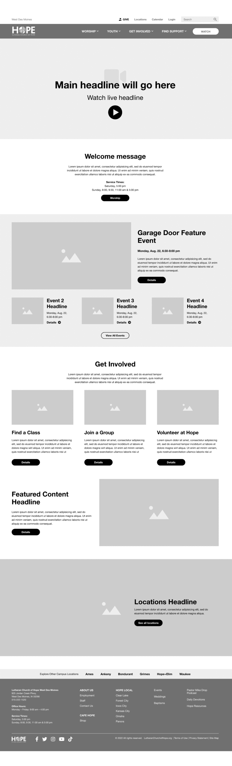
Homepage
- Worship front and center
- Clearer entry points
- Ability to feature time-sensitive content
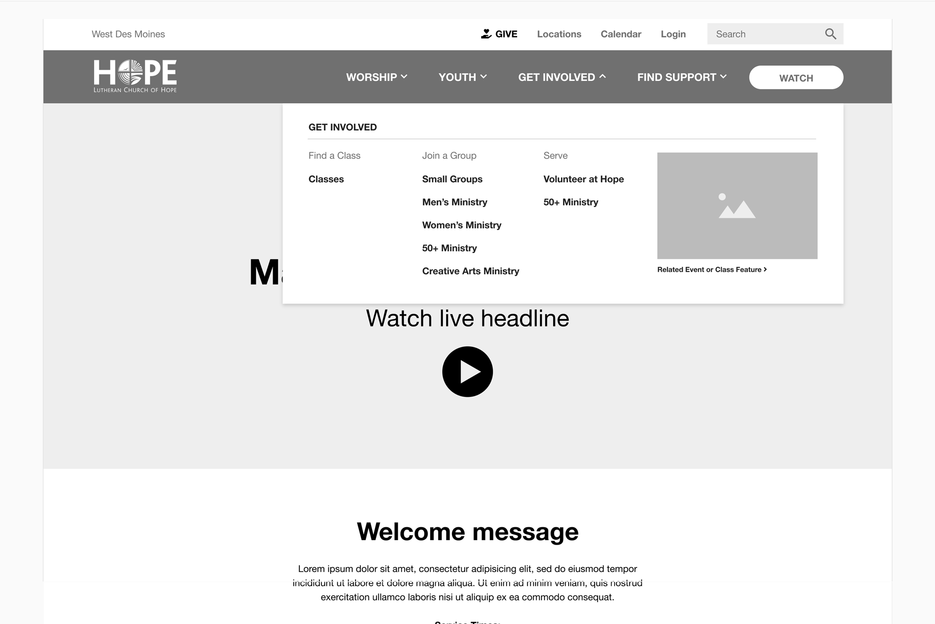
Mega Menu
- Clearer labels
- Better grouping
Ministry Pages
- Filtered content relative to each ministry
- Better overview of ministry offerings
High-fidelity Layouts
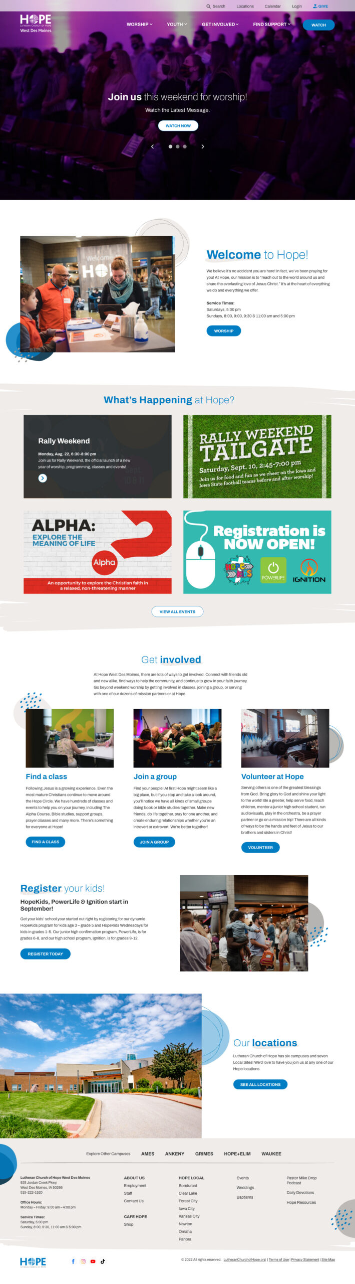
Home page now highlights what matters most: worship, what’s happening soon and clear next steps. Key actions are visible without scrolling, reducing reliance on the calendar or search.

Ministry pages are organized by purpose and audience and are uniquely branded. Each page gives context up front—what it is, who it’s for, and how to get involved.
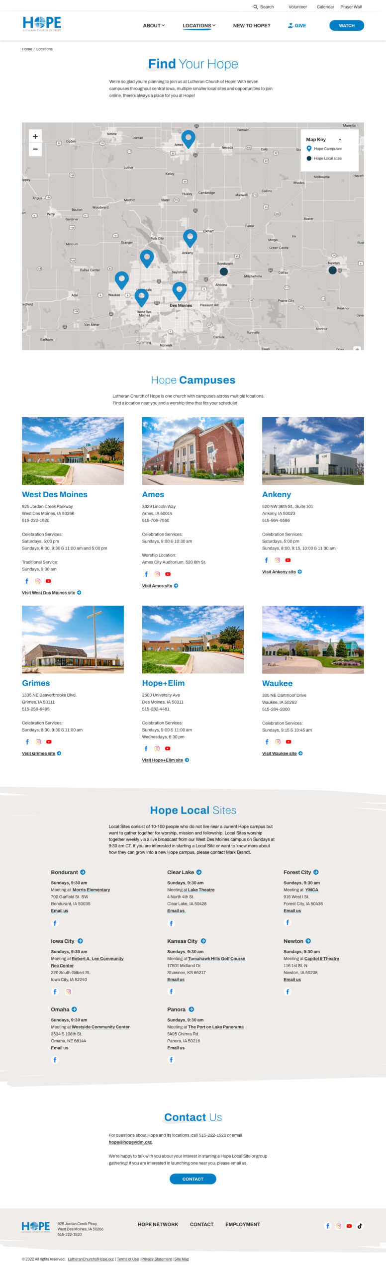
The locations page provides a clear way to explore each campus. Users can search by map or browse detailed listings, with clear distinction between physical campuses and Hope Local gatherings.

Classes moves beyond a calendar-only model by helping people browse and understand classes before choosing when to attend. They are pre-filtered by campus to reduce steps.
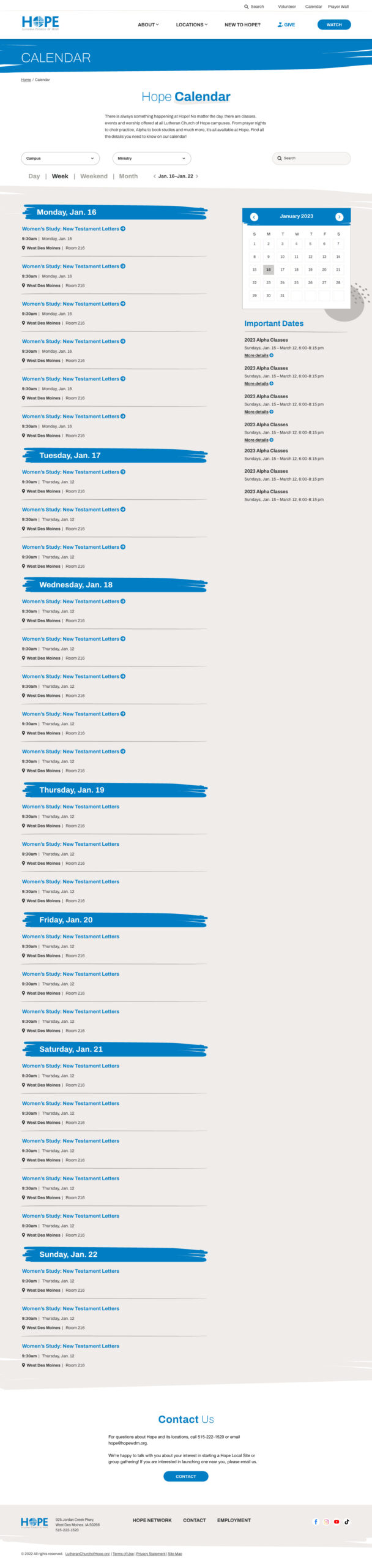
The calendar is repositioned as a planning tool, not the primary way to discover content. Filters help users quickly see what’s relevant without overwhelming them.

The missions page organizes a complex set of global and local opportunities into a more approachable experience. Users can explore different ways to serve, view past mission trip locations and find upcoming mission events without feeling overwhelmed.
The Result
By the Numbers
In the year following launch, organic search sessions increased 14% year over year. Engagement rate climbed from 55.8% to 59.4%, and average engagement time from organic search visitors more than doubled, growing from 36 seconds to 1 minute 21 seconds.
One platform. Seven campuses. A seamless experience. The redesign delivered a clear, scalable website that finally matched the church’s growth—solving usability challenges and giving staff the tools to manage content efficiently.
Key outcomes
A Site People Can Actually Navigate
Clear menus and direct pathways to top tasks like worship, classes, volunteering, support, and missions.
Content Where People Expect It
Key details visible directly on pages, reducing reliance on the calendar to find what’s happening and when
Ready for the future
The flexible system can support new campuses without starting over.
Together, these changes align user needs, content strategy, and day-to-day management, creating a strong foundation for growth.